DRAMATIC BOX MOLDING
Dramatic Box Molding
First off if you missed part 1 of this project, you'll want to head over to the previous post to see how far this area has come in the last couple of weeks. Believe me it has come a long way...
Okay now let's talk about how I was able to create this dramatic box molding look! This was my vision all along to do box moulding. I knew it would be a little tricky figuring out the correct sizing and dimensions for the boxes. Plus, the angles to cut were going to be tricky but that wasn't going to stop me! I was ready for the challenge and the end result.
I'll share a trick I learned for cutting a perfect 45 degree angle after realizing I gotta figure something out because my brain was fried without this easy trick!
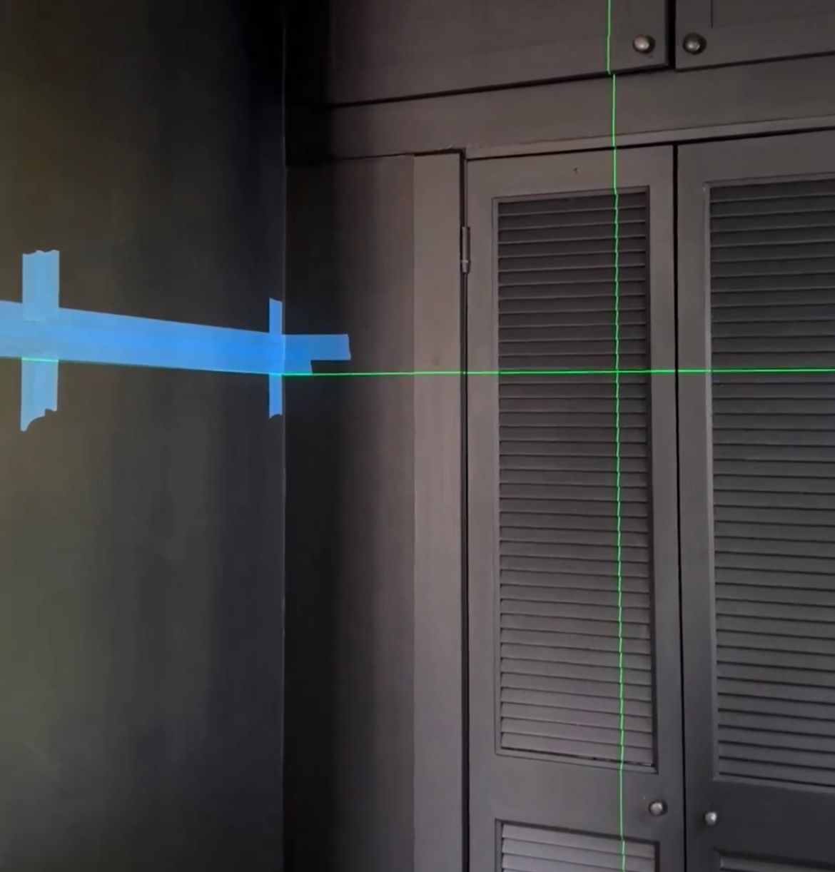
To begin this process meant figuring out dimensions and tapping them out on the wall to make sure I visually liked the placement. To insure they are perfectly level/straight I ordered this Cross Level. It fits right onto a tripod so it can easily be moved around to different heights. We especially needed to use this as our 130-year-old home isn't level in all places...
I trick I have on how to figure out angles
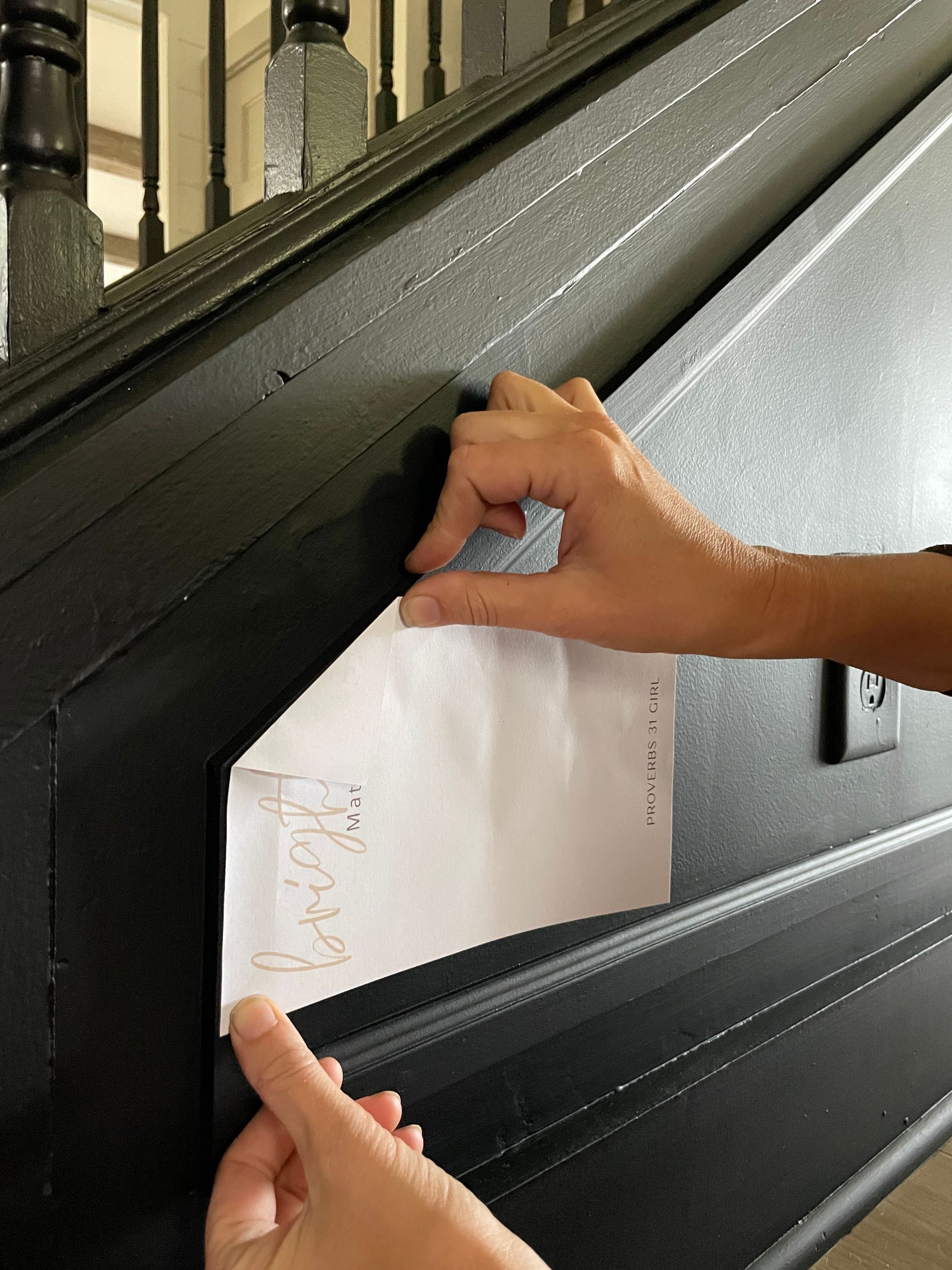
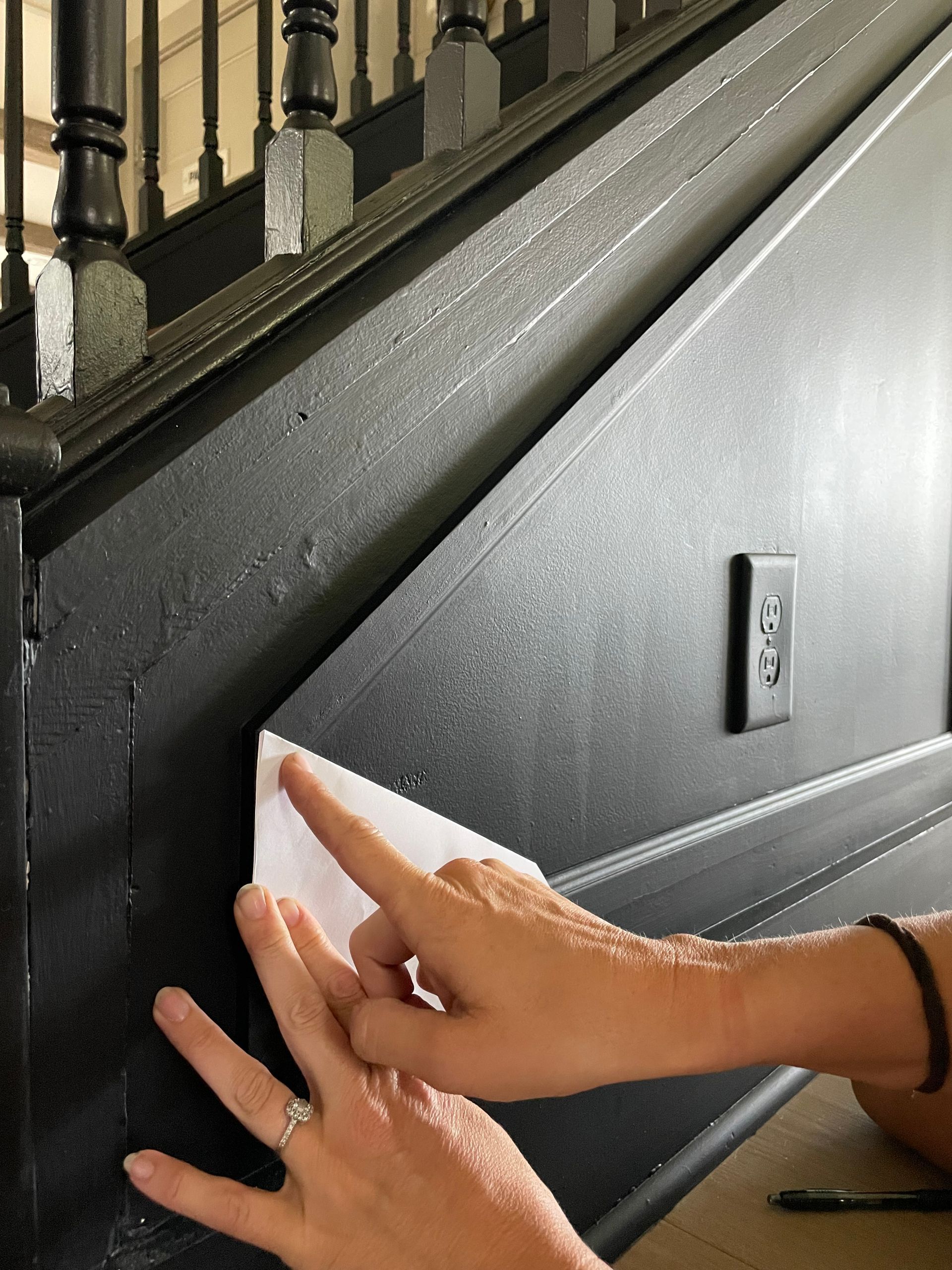
Step #1, #2 and #3
Line up 1 side of your paper and fold over the other side of the paper tab down to match the angle you need to cut. Cut that flap off.
Once that tab is cut. Fold that side perfectly over again. The bottom left corner has stayed in the same spot the entire time. Like image #2.
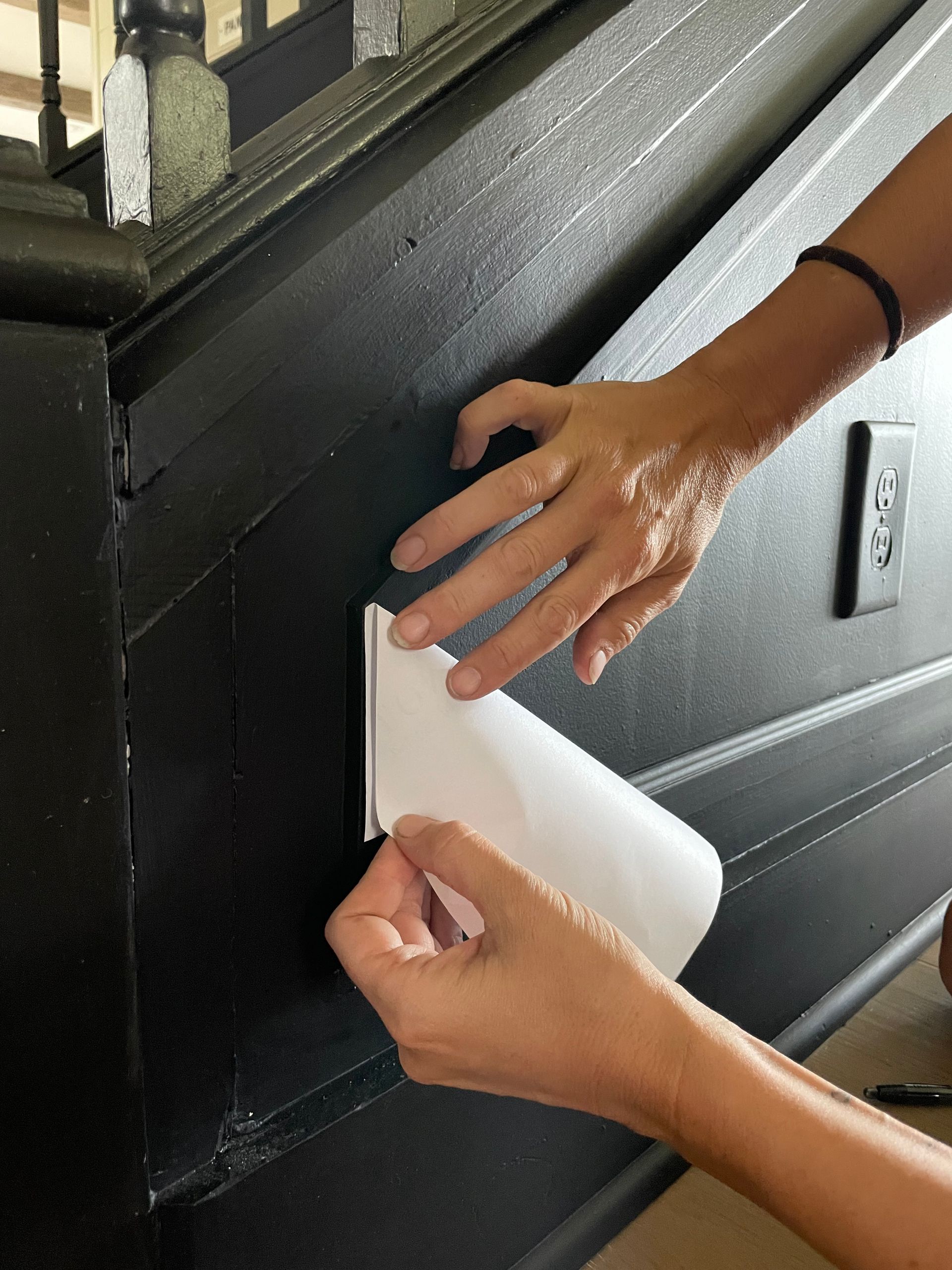
The tip is now the point of your angle. The 3rd photo point.
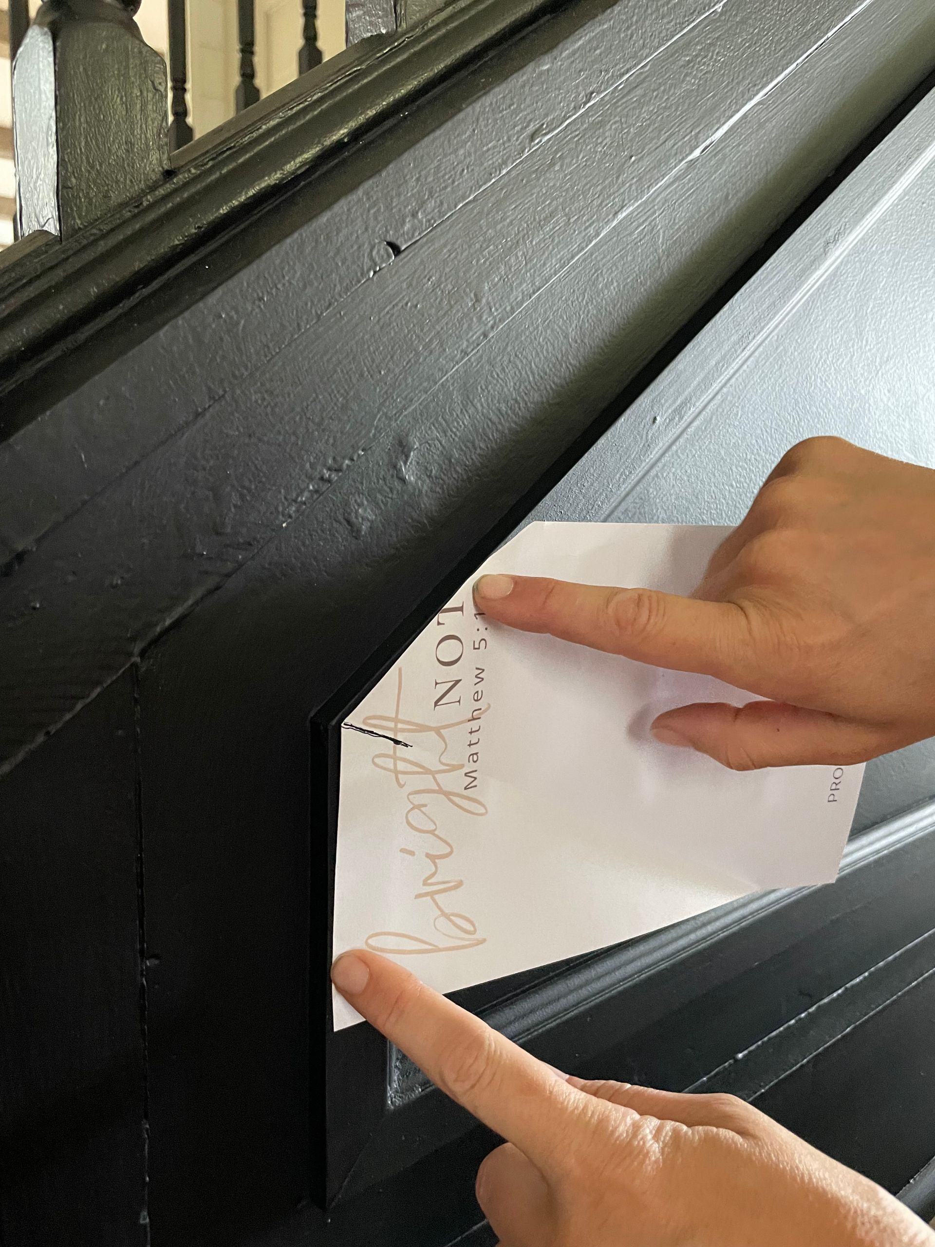
Step #4
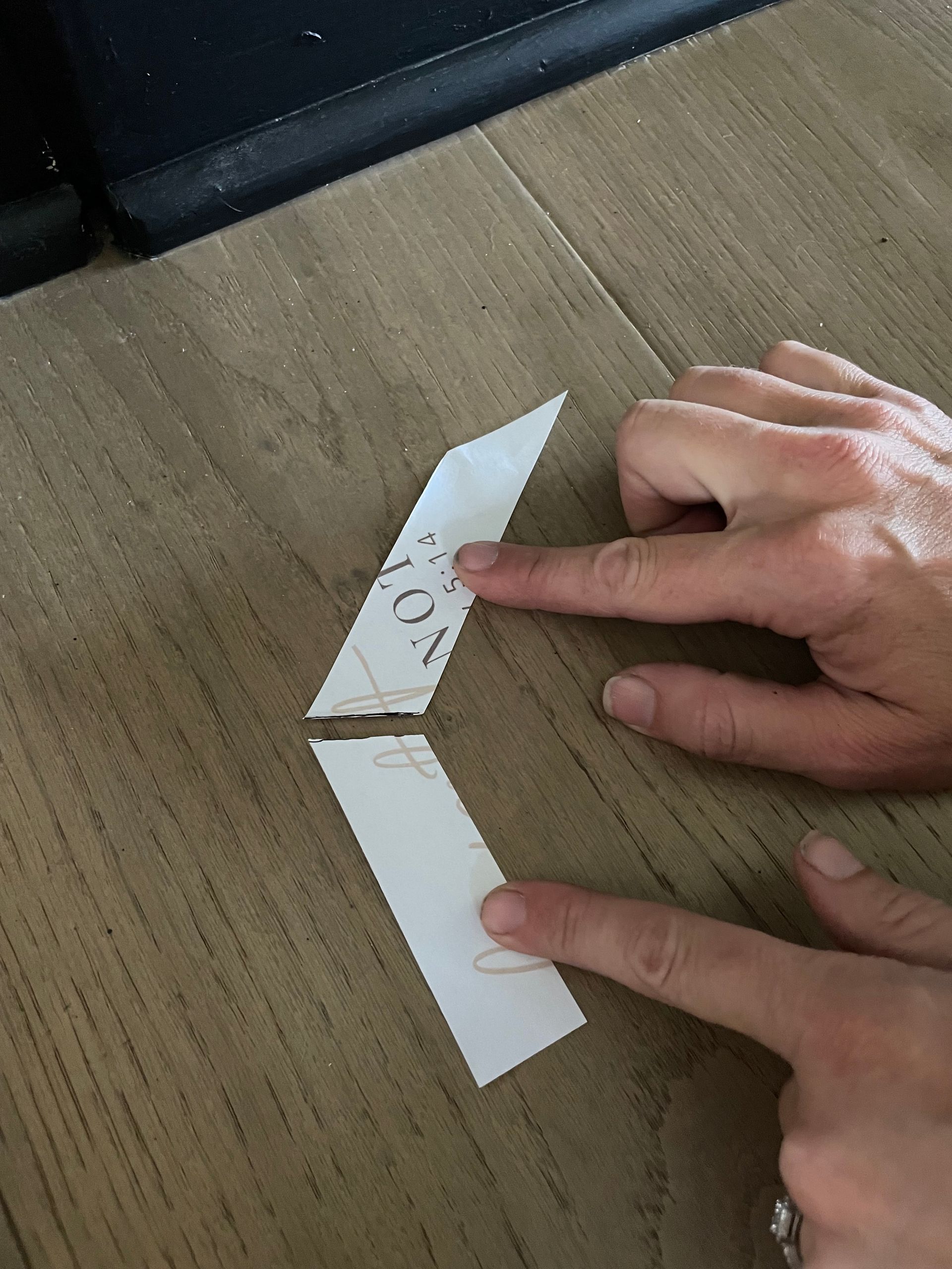
Mark your point with a pen, cut down the middle. There you have your angle right there see in photo #5
You get the perfect angle every time!
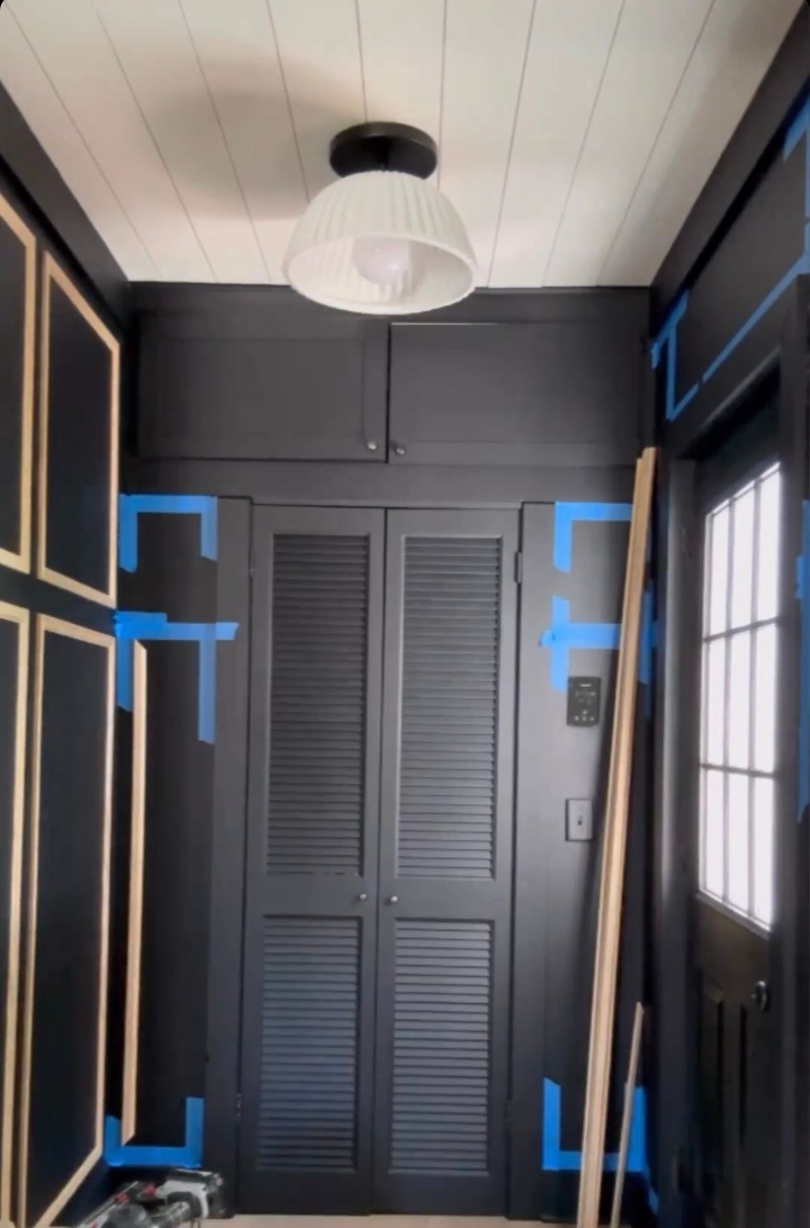
You can see how I framed my boxes out and then how it looked with some framed with trim. I kept cruising along cutting, lining up and nailing the boxes in place... Once that was done I was thrilled that the BLUE tap could finally come off!
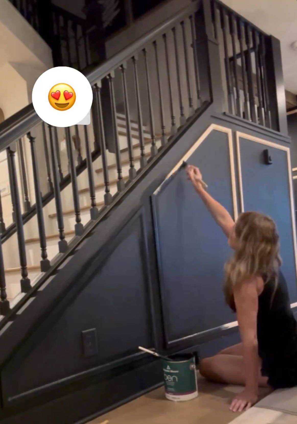
Time to blend!! The moment I've been waiting weeks for...
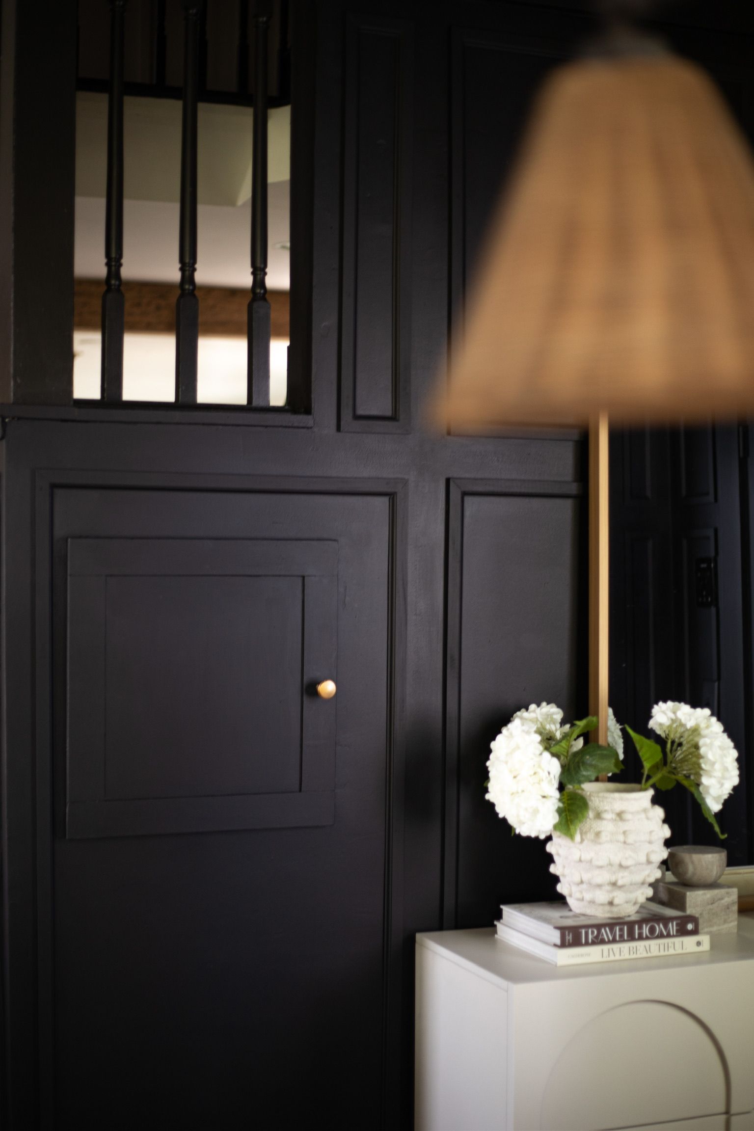
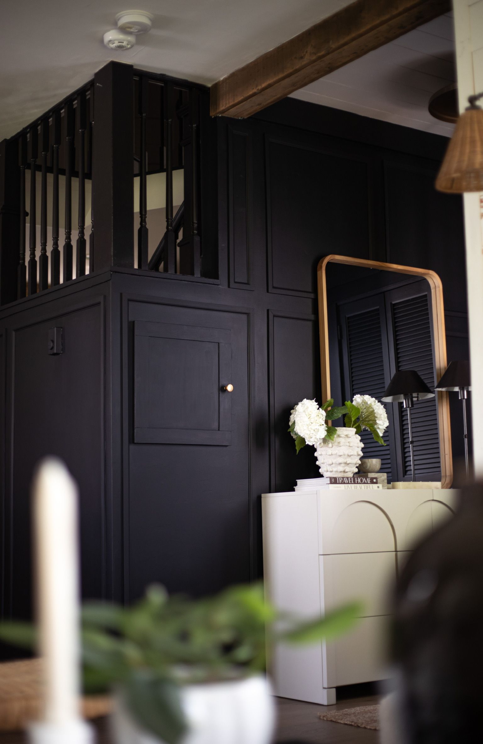
The black paint color I always use is call Onxy by Benjamin Moore. I usually get it in a satin finish as well but the time I wanted it to be more of a muted black. So I went with a matte finish. Definitely the right call!
Note: the first coat of the black may come out looking navy blue. Don't worry once the 2nd coat in on it looks like the correct color.
After
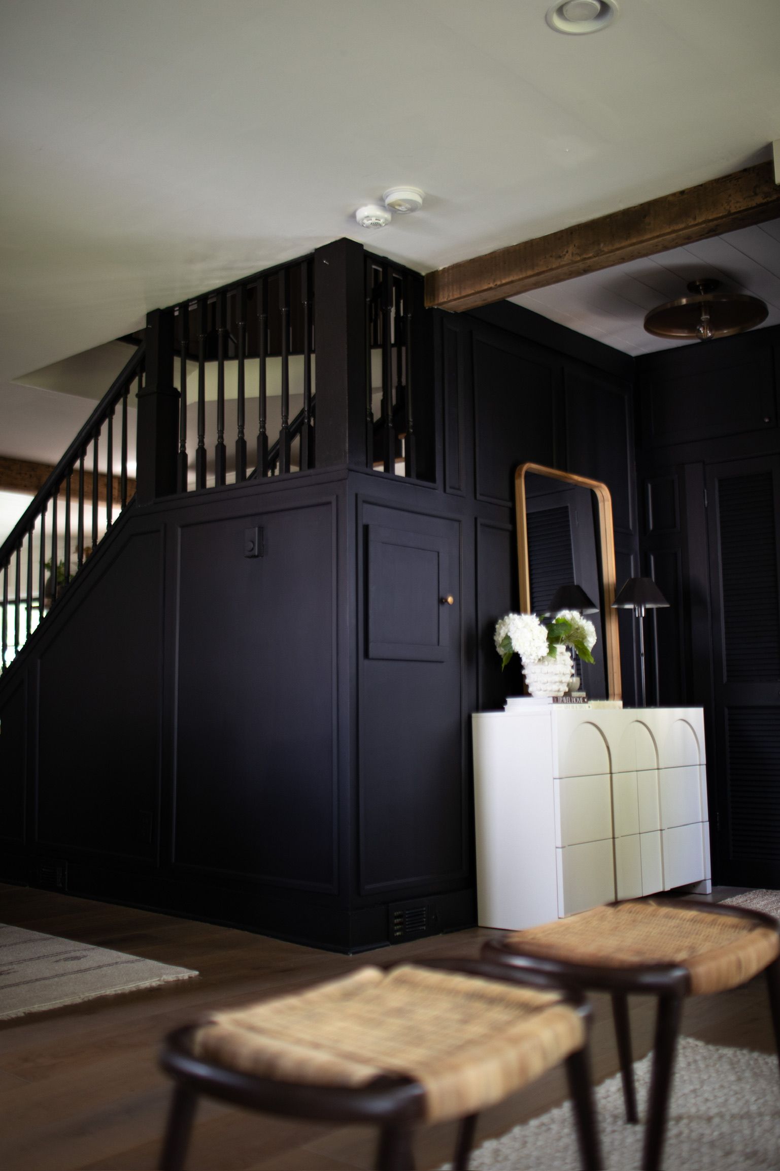
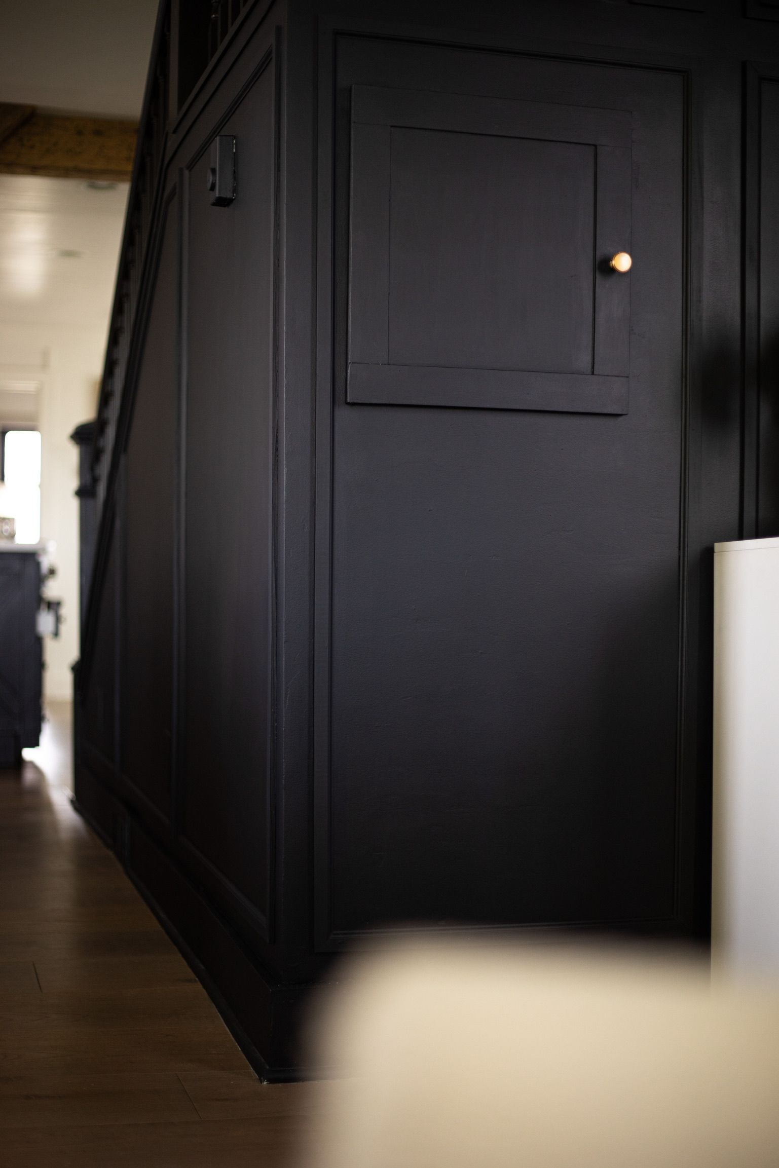
Woah the dramatic elevated look is everything I would of hoped It would be and more! So bold and beautiful. I feel like it made the staircase grander as it didn't really have a place before. Now it is a statement.
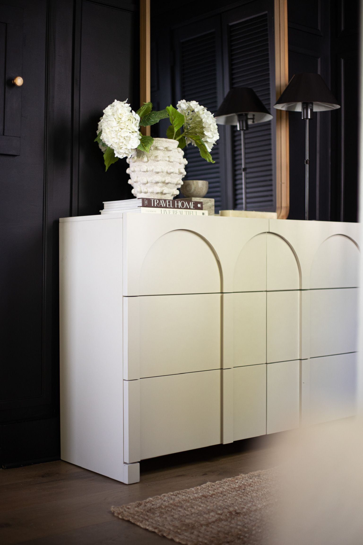
The Cream Arched Buffet Cabinet I was on the hunt for. We needed a little but more storage over here. The downside of older homes, they don't come with much storage at all. So, we are always looking for ways to get creative with storing items.
I am loving "Arches" in this style season of my life so these caught my eye immediately.
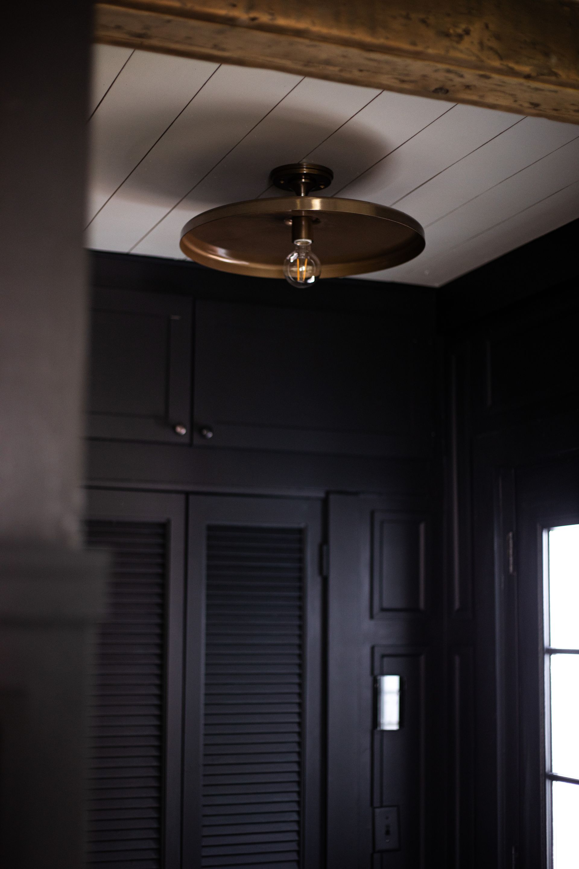
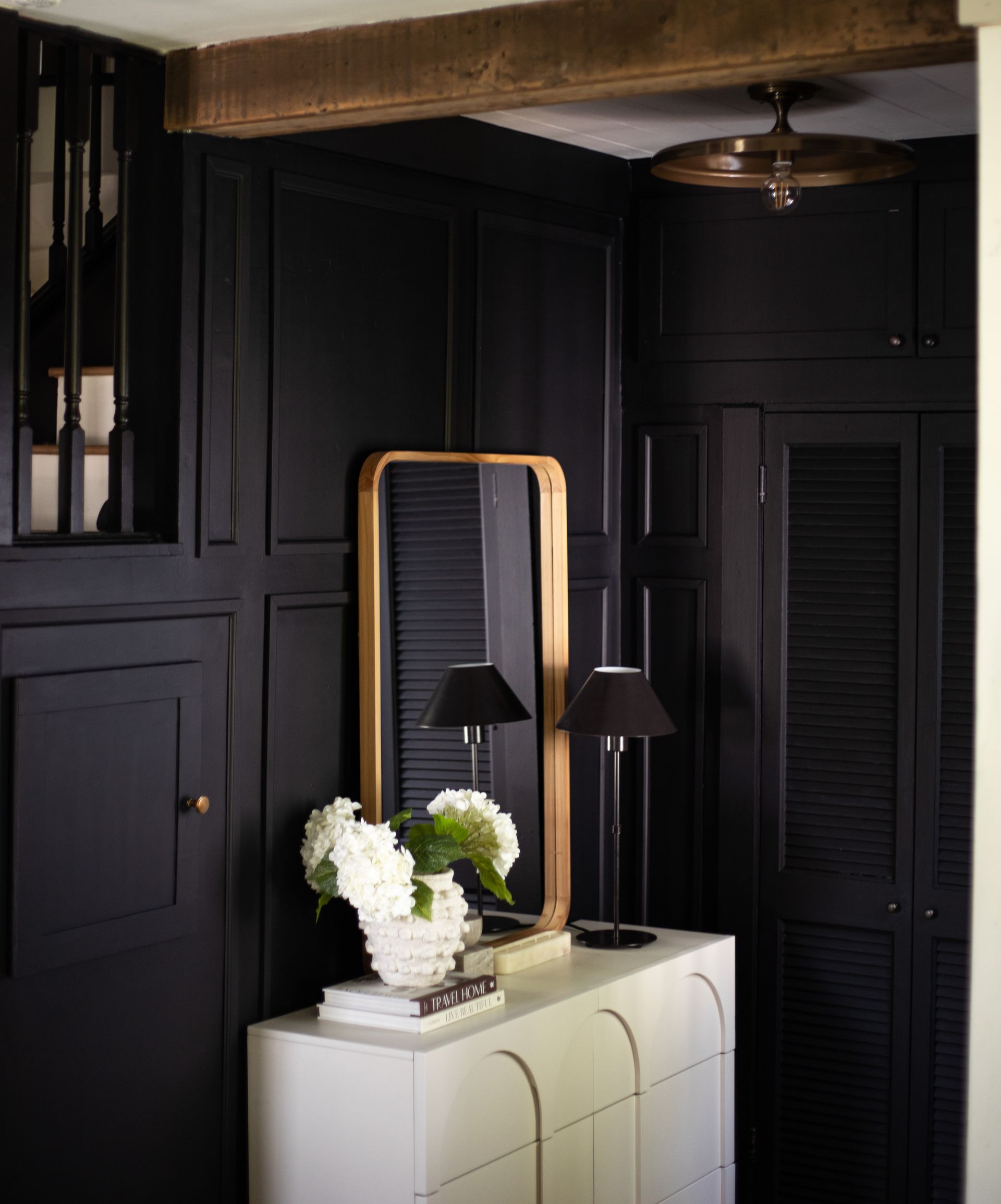
This gorgeous Shades of Light Brass Pendant is dreamy. I was drawn to the bold but versatile look. I feel like there are many different style that could work around it.

Thanks for coming on this journey with me. This has been a project I've been wanting to attack for over a year now but the idea of smoothing the walls out always intimidated me. It was a lot of work and a mess, but completely manageable and doable. And the results are so worth it!